How to Design a Magazine Layout
How to Design a Magazine Layout
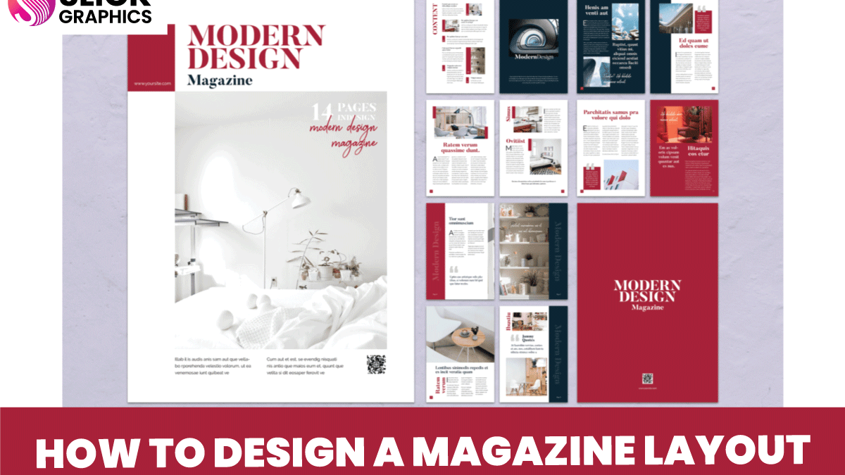
Designing a magazine layout is an art that combines creativity, structure, and functionality. At Slick Graphics, we specialize in bringing ideas to life through exceptional design. Here’s a brief guide to crafting a stunning magazine layout:
1. Define the Purpose and Audience
Before designing, understand the magazine’s target audience and purpose. Whether it’s fashion, business, or lifestyle, the content should dictate the design.
2. Create a Grid System
Use a grid to structure the layout. Grids ensure consistency and balance, making it easier to align text, images, and other elements.
3. Choose Fonts and Colors Wisely
Select a font pairing that complements the magazine’s tone—modern, classic, or playful. Stick to 2-3 fonts and establish a color palette that enhances readability and aesthetics.
4. Focus on Visual Hierarchy
Use larger fonts or bold colors for headlines to grab attention. Organize content so the reader’s eyes flow naturally from one section to the next.
5. Incorporate High-Quality Images
Images are the centerpiece of a great magazine. Use professional photos or graphics that align with the article’s theme. At Slick Graphics, we emphasize vibrant visuals for maximum impact.
6. Keep White Space in Mind
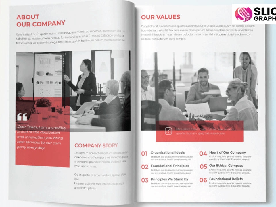
White space enhances readability and gives the layout a clean, polished look. Avoid overcrowding elements.
7. Add Branding Elements
Incorporate logos, colors, or design features that reflect your brand. Slick Graphics ensures each design is on-brand and memorable.
8. Proofread and Finalize
Ensure the content is error-free, and all design elements are aligned. Review the layout to confirm it meets the magazine’s objectives.
Whether you’re a beginner or a pro, designing a magazine layout requires attention to detail and creativity. For professional designs that stand out, trust Slick Graphics—your partner in bringing bold ideas to life.


