How to Design Effective Business Cards: Tips and Best Practices
How to Design Effective Business Cards: Tips and Best Practices
A business card is often the first impression people have of your brand. It’s not just a piece of paper with your contact information; it’s a reflection of your professional identity. Designing an effective business card requires more than just slapping on your name and number. It involves careful consideration of elements like layout, color, font, and even the material used. In this blog, we’ll walk you through the essential tips and best practices to create business cards that stand out and leave a lasting impression.
1. Keep It Simple
When it comes to business cards, less is often more. Avoid cluttering your card with too much information. Focus on the essentials: your name, job title, company name, and contact details. If space allows, you might include a tagline or a brief description of what you do, but keep it concise. The goal is to make the card easy to read and visually appealing.
2. Choose the Right Font
Font choice plays a crucial role in the readability and overall look of your business card. Stick to professional, easy-to-read fonts that match your brand’s personality. Avoid overly decorative fonts, which can be hard to read. Also, be mindful of font size—small text can be difficult to read, while large text might look unprofessional. A font size between 10-12 points is typically ideal for the main text.
3. Incorporate Your Brand Colors
Your business card should reflect your brand’s identity, and color is a big part of that. Use your brand’s colors to create a cohesive look that aligns with your other marketing materials. However, don’t go overboard with too many colors; two to three colors are usually enough to create a professional and eye-catching design.
4. Use High-Quality Materials
The material of your business card can speak volumes about your brand. A flimsy card can leave a bad impression, while a sturdy, high-quality card suggests that you take your business seriously. Consider using materials like thick cardstock, matte or glossy finishes, or even textured paper to make your card feel more substantial.
5. Include a Call to Action
While your business card primarily provides contact information, adding a subtle call to action can encourage recipients to take the next step. This could be a special offer, a website link for more information, or a QR code that directs them to your online portfolio or LinkedIn profile. Just make sure it doesn’t overpower the primary information on your card.
6. Pay Attention to Alignment and Spacing
Proper alignment and spacing can make a big difference in the overall look of your business card. Ensure that text and elements are evenly spaced and aligned for a clean, professional appearance. Margins should be consistent, and there should be enough white space to prevent the card from looking crowded.
7. Consider Double-Sided Printing
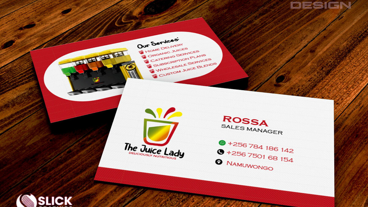
If you have more information to share or want to include additional elements like a logo or social media handles, consider using both sides of the card. The front can contain your primary contact information, while the back can showcase your logo, a tagline, or even a brief overview of your services. Double-sided cards offer more space without cluttering the design.
8. Proofread Thoroughly
There’s nothing more unprofessional than a business card with a typo or incorrect information. Before sending your design to print, double-check all the details, including names, phone numbers, and email addresses. It’s a good idea to have someone else review it as well, just to catch any errors you might have missed.
9. Utilize Unique Design Elements
If you want your business card to stand out, consider adding unique design elements. This could include rounded corners, embossing, foil stamping, or even a custom shape. These features can make your card more memorable and reflect the uniqueness of your brand.
10. Test the Design
Before printing a large batch, it’s wise to test your design. Print a few copies to see how they look in real life. Pay attention to how the colors appear on paper, the feel of the material, and the overall readability of the card. Making adjustments at this stage can save you from costly mistakes later.
Conclusion
Designing an effective business card is an art that requires careful consideration of various elements. By keeping your design simple, choosing the right font, incorporating your brand colors, and using high-quality materials, you can create a card that not only provides contact information but also leaves a lasting impression. Remember, your business card is a reflection of your brand—make it count.
Let Slick Graphics help you design and print business cards that truly represent your brand. Contact us today to get started!


