Mistakes to Avoid When Designing Soap Labels
Mistakes to Avoid When Designing Soap Labels
Mistakes to Avoid When Designing Soap Labels, Designing soap labels is an essential part of branding, but it’s easy to make some mistakes that can undermine your product’s appeal. Here are key mistakes to avoid when creating soap labels:
-
Overcrowding the Label
Less is often more. Keep your design simple and clean. Too much text or graphic elements can confuse consumers. Focus on the essential information, such as the product name, ingredients, and your brand logo. -
Poor Typography
Typography is crucial for readability. Use fonts that are clear and easy to read. Avoid overly decorative fonts that might make the label look cluttered and hard to decipher. -
Ignoring Brand Identity
Your soap label should reflect your brand’s unique identity. Use colors, fonts, and imagery that align with your overall brand aesthetics. Slick Graphics can help ensure your design is cohesive and visually appealing. -
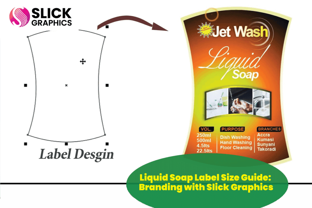
Not Considering Label Size
Make sure the label fits well on the soap packaging. A label that’s too large or too small can look awkward and may even lead to missing important information. -
Forgetting to Test for Print Quality
The colors and details may look perfect on your screen, but they can appear differently in print. Ensure your design is print-ready by checking colors, resolution, and overall quality.
If you need professional help designing your soap labels, contact Slick Graphics at +256 702 988 012. Let us help you create labels that stand out on the shelves and reflect the quality of your product.
